Microsoft is rolling out a new SharePoint document library interface, with broad release expected around late January. I’ve recently gained access to it in my own organisation, and I wanted to share some early, real-world thoughts — especially for anyone who’s been using SharePoint for years and is about to log in one morning and think, “Hang on… where did everything go?”
This is a significant change. Not a tweak. Not a visual refresh. A genuine shift in how people interact with document libraries.
And like most big SharePoint changes, it took me a little while to recalibrate.
Free: Grab the M365 Map — the library experience makes more sense in context.
hub.simplysharepoint.com/m365-map
Download the M365 MapFirst reaction: this will feel disruptive (at first)

If you’ve been working in SharePoint for a long time, muscle memory is real. Where things used to be matters. I’ll be honest — it took me a bit to get used to the new layout, and I’m still adjusting.
That said, once the initial “everything feels different” moment passed, I could see what Microsoft is trying to do here.
And some of it is genuinely good.
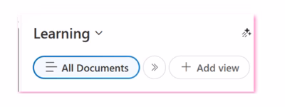
Views are finally front and centre — and that matters
One of the biggest improvements is that views are now impossible to ignore.
This is huge.
Views are one of the most underutilised but powerful parts of SharePoint information architecture. When used properly, they let you:
- Keep lots of content in one place
- Slice and dice information without folders
- Filter, sort, and personalise what you see
- Make SharePoint feel far more human and less chaotic
Putting views front and centre sends a strong signal that this is how Microsoft wants people to work — and I fully support that direction.
From an IA and governance perspective, this is a very good move.
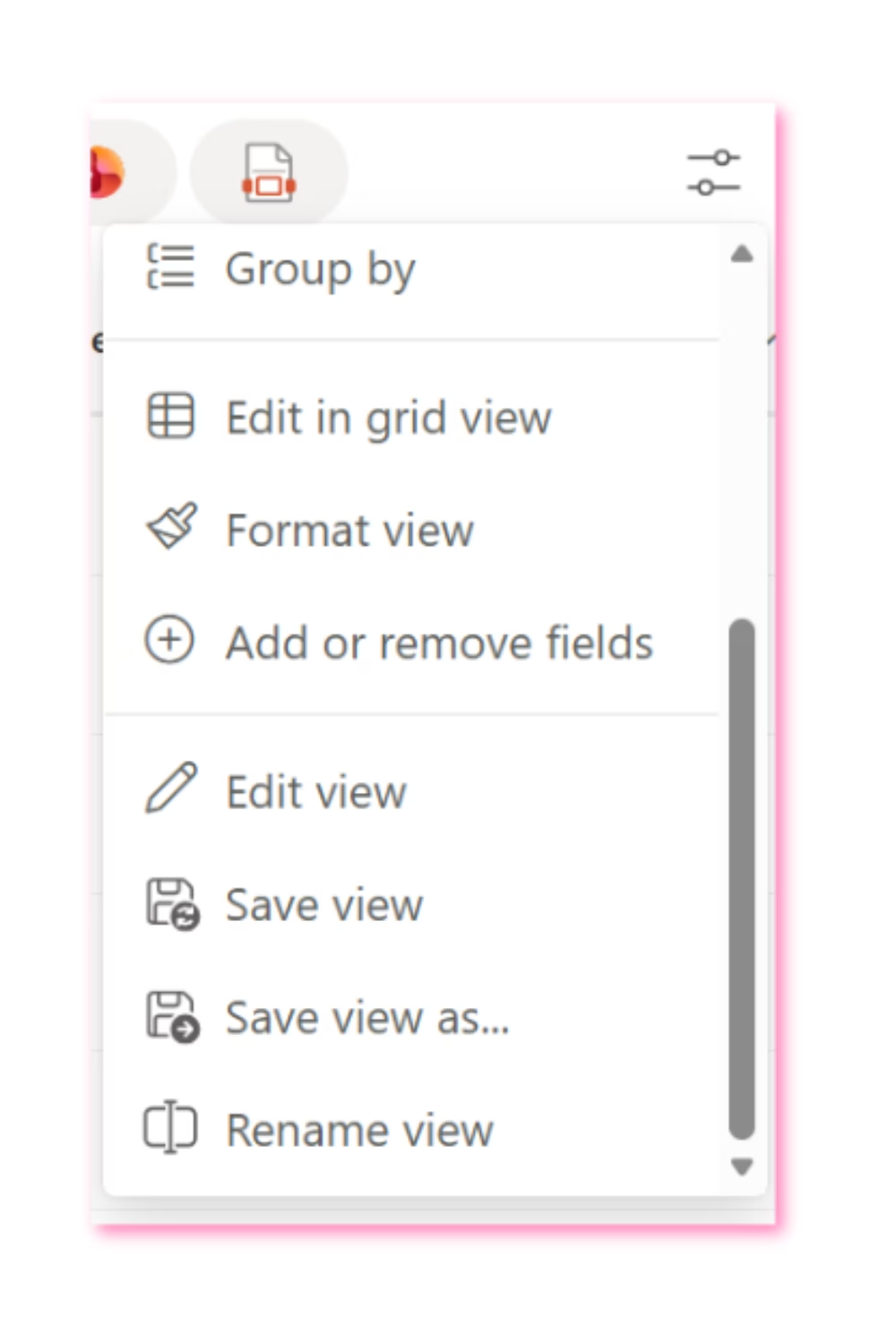
Creating views is easy… editing them is not (yet)
Here’s where I struggled — and where I know end users will struggle too.
Creating and saving a view is now very intuitive. The controls are right there on the screen: add columns, hide columns, save a view. That part is great.
But once you’ve created a view, finding how to edit it further is not obvious at all.
Things like:
- Adjusting filters
- Sorting data in a specific way
- Switching to flat views (no folders)
- Changing layouts (like newsletter-style views)
All of that functionality is still there — but it’s tucked away in a dropdown over on the right. It took me far longer than it should have to find it.
If it took me a while, I can guarantee end users are going to get stuck.
This change opens the door to better SharePoint conversations
Interestingly, this new interface has created an unexpected opportunity.
I’m now running a webinar specifically to walk staff through the new document library experience — but I’m also using that time to properly explain views and how they can transform the way people work in SharePoint.
That’s a good thing.
If this interface change nudges organisations into finally learning how views work, the long-term payoff could be huge.
The quick filters feel… a bit off
The new quick filter buttons for PDF, Word, Excel, etc. are interesting — but I’m not convinced they reflect how people actually think when they’re looking for information.

In the real world, users usually think in terms of:
- Policy
- Procedure
- Template
- Form
Those are document types, not file formats.
From an information architecture point of view, I would have loved to see key metadata columns surfaced here instead, allowing organisations to design those quick filters around how their content actually works.
That would have been incredibly powerful.
“New” and “Templates” feels crowded
The area on the right where New and Templates live feels a bit busy.
I also think there’s a missed opportunity here. Many users don’t realise they can create and use document templates at all. A clearer “Use a template” call-to-action could really help drive better, more consistent document creation.
Templates are one of those quiet SharePoint superpowers that rarely get used — and this would have been a great chance to highlight them properly.
Everything else? Mostly familiar
Once you get past the interface shift, the fundamentals are the same:
- Working with documents
- Uploading
- Sharing
- Editing
That’s reassuring. But don’t underestimate how big this change will feel for long-time users. This is not a subtle update.
Final thoughts
Overall, I’m genuinely excited about where this is heading.
Yes, there are some usability tweaks I’d love to see. Yes, there will be confusion at first. But making views central to the document library experience is absolutely the right move — especially for organisations trying to reduce chaos, improve findability, and prepare for AI and Copilot.
This is a big change. A good one. And like most good SharePoint changes, it comes with a learning curve.
If nothing else, it’s a timely reminder that SharePoint works best when structure does the heavy lifting — not user memory.
And that’s something I’ll always advocate for.
Master your document libraries: SharePoint Essentials — the complete end-user guide.
hub.simplysharepoint.com/essentials-system
Explore SharePoint Essentials
Hi, I’m Liza 👋
I’ve been working with SharePoint for nearly two decades, across consulting and in-house roles, helping organisations design, clean up, and scale their Microsoft 365 environments.
My focus is information architecture — the unglamorous but critical layer that determines whether search works, governance sticks, and tools like Copilot help… or quietly make things worse.
Through Simply SharePoint, I share practical, real-world guidance on structuring libraries, designing metadata, managing permissions, and fixing the kinds of issues that naming conventions, policies, and “best practice” slides never really solve.
Everything here is based on how SharePoint is actually used — not how we wish it was used — with a strong emphasis on foundations that scale and hold up in the AI era.
Thanks for sharing this. It really resonated. I’ve had access to the new library too, and honestly, I’ve already run into some problems. Some things are harder to find than they should be, and a few interactions are not clear unless you know where to look. That worries me, especially for long-time users. That said, I still find the direction exciting. I can see what Microsoft is trying to achieve, even if the end goal is still a bit unclear. Pushing views to the front is a bold move, and I like the idea. I’m just not sure the path there is as clear as it could be yet. This change seems like it will spark good conversations, but there will also be quite a few “where has that gone?” moments along the way.
Author
Thanks Martyn. After using this new interface for a while now I still get stuck on some things. I find the views area to be a bit awkward in that I always fumble when looking for views when before it was just one drop down. Also edit in grid view and other items appear to get lost. That has been the feedback as well from my end users. They like the create button being chnaged though which I found interesting.